Batman's Costume: Ever be Blue & Grey Again?
- Thread starter ChunkyZergling
- Start date


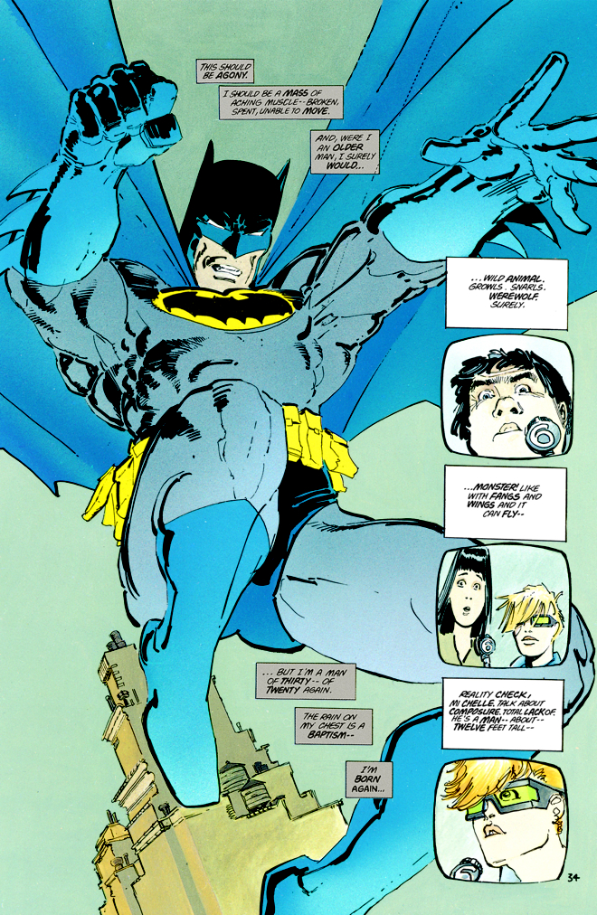
Frank Miller used it, he even created a reason for the yellow oval being there.


I could see Nolan using it too but it would probably be smaller (like the TDK chest logo) and gold, not yellow. In fact, I remember thinking back in June of 2007 when we got the first teaser pic of the TDK suit of Batman on the police car that it was a small, edgy bat symbol trimmed in gold due to the angle and lighting. That was speculated for months before we got a clear shot of what we all know now.
It's a known fact that the yellow around the symbol was added so that DC could trademark the Bat symbol like they did with Superman's 'S'.
Miller's use of the yellow and creation of the reason behind it is completely satirical keeping in theme with the story it's in, as a send up to not only society at the time but the state of the industry as well.
There is a reason it wasn't included in Year One.
I'm not the one putting all this thought into it like Batman is a real person.
Sorry to those of you who didn't know that.


WHAT!?!?! Batman isn't real?
____ you, Batty. ____ you.
Roy Batty isn't real either, he's played by some actor named Rutger Hauer. Replicants aren't real!


The symbol doesn't and shouldn't be seen. By anyone. The whole argument that its to attract the eye of the criminal so they aim at his chest is retarded and not Batman. Batman shouldn't be seen, he should be hidden in the shadows.
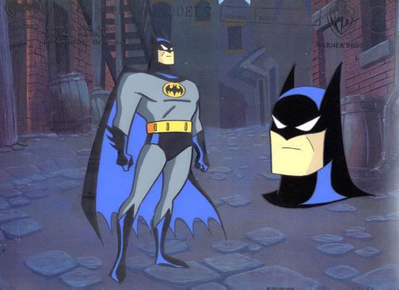
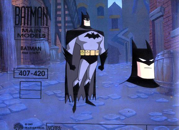
Oh and as far as BTAS goes, I always preferred the BTAS classic look to the revamped TNBA look. I hated TNBA designs for the most part, especially the Joker's.
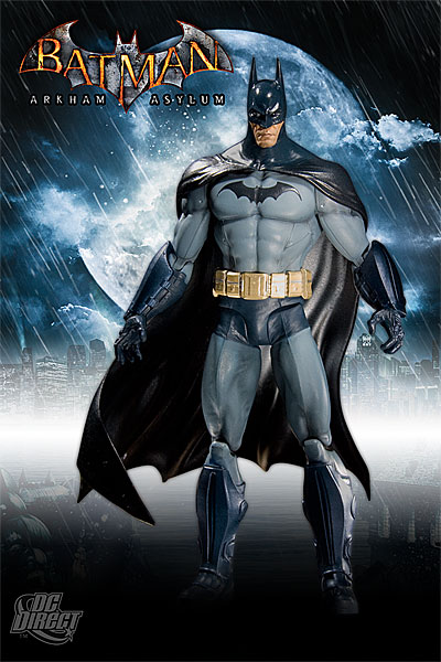
Arkham Asylum and Arkham City -- which I would consider among the most definitive Batman universes -- both used dark blue and grey ...
I'm not sure, but I think that's just the blue lighting effect. I think the Arkham Asylum suit is actually black and grey, but the blue lighting gives it a blue-ish tint.

Enter your email address to join: