I like just the plain bat without the oval


Actually, I agree that it was pathetic for Adams (a true legend) to try to be Jim Lee, because the latter is the most overrated comic book artist of our time.
A true legend would have confidence in his own stuff.
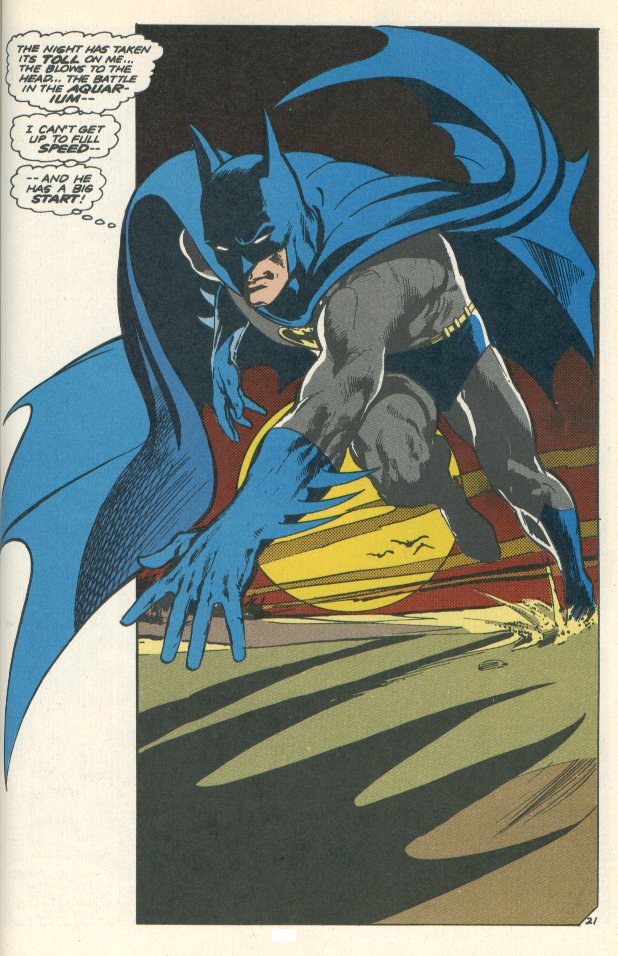
Even first appearance Batman had blue highlights.
I don't see it being outside the realm of possibility for the editors to ask him to attempt to draw Batman more in tune with Lee's.
 Agreed. Especially since Lee is one of the egomaniacal ____heads currently running DC. That sounds exactly like something they would do. But to wofford's point, if this was the case Adams did go along with it, which is a shame. He's a much more historically important artist than that Image-era twat.
It doesn't really matter to me what they change it to now since I don't read comics anymore, but this is the most iconic look he ever had as far as I'm concerned. Adams FTW.
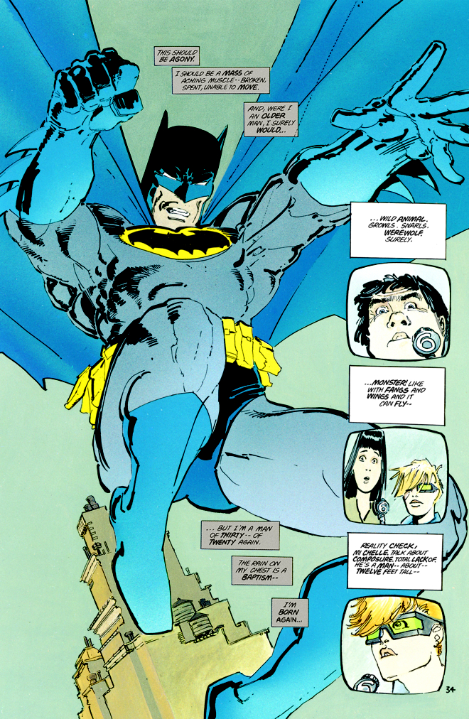
 Love this Batman look also, one of my fav's
Debating which is lamer. This thread or that joke.

I like just the plain bat without the oval
I think the oval is important for contrast - the black symbol on gray fabric is too hard to see (especially if it's at night). Maybe we can see it because it's a comic, but I would think the characters in the book would not be able to see it - so what's the in-character rationalization for Batman including the Bat-motif, if nobody's actually going to be able to make it out?
I have the same problem with the Nolan movie suits - the black-on-black Bat symbols are so hard to make out, nobody would realistically know it was there. So why bother? (Though I like those suits for other reasons)
That being said, the black-on-gray symbol isn't always bad in my book. I like the small version often depicted for the Year One era. It makes his outfit look simpler and more primitive, before he learned and adapted enough to have a more effective, sophisticated suit, which is an effective visual tactic.
What I definitely like least of all is the GIANT black on gray, like the Alex Ross batsuit you posted.
Not only does it suffer the contrast issues, it's also too big a symbol to be seen effectively. Often the cape is going to cover it at the corners and sides, when draped down (which you don't always see, because of the dynamic poses he's drawn in - but I don't think Batman switches instantly from dynamic pose A to dynamic pose B without normal motion).
It also suffers because they're large enough to be affected by the curvature of his pecs, as it wraps around. So unless you look at him face-on, you're not going to see the whole Bat image (since the far side will wrap around his pecs).
So these two above points again raise the question - why bother, if nobody's actually going to see it unless they're in the perfect viewing position (face-on, in a well-lit position, with Batman standing in a dynamic pose so his cape is out of the way)?
")
The yellow oval works sometimes. Others, it doesn't. It just depends on the material. Not all Batman books & stories need to be edgy and deadly serious.
I love the dark stuff as much as anyone. But, IMHO, Batman starts losing its appeal when it takes itself a little TOO seriously (a line where Nolan comes dangerously close to the edge). Balance is necessary. As much as it's cool to have the ultra-serious, brooding and "realistic" Batman it's also important to remember that at its essence it's just another funnybook about a guy putting on a crazy costume and punching bad guys in the face. It's all rather ridiculous, and I don't mind acknowledging that... so stuff like the yellow oval never phases me.
 I agree with every word you said there, Irish. And Neal Adams' Batman is legendary. The image floating around the thread is from one of my favorite Batman stories.
The yellow oval works sometimes. Others, it doesn't. It just depends on the material. Not all Batman books & stories need to be edgy and deadly serious.
I love the dark stuff as much as anyone. But, IMHO, Batman starts losing its appeal when it takes itself a little TOO seriously (a line where Nolan comes dangerously close to the edge). Balance is necessary. As much as it's cool to have the ultra-serious, brooding and "realistic" Batman it's also important to remember that at its essence it's just another funnybook about a guy putting on a crazy costume and punching bad guys in the face. It's all rather ridiculous, and I don't mind acknowledging that... so stuff like the yellow oval never phases me.
Could you see it being used by the likes of Nolan, or even Frank Miller? I can't even picture that.


Enter your email address to join:

